How to Style a Gallery Wall with Artisan Art Prints
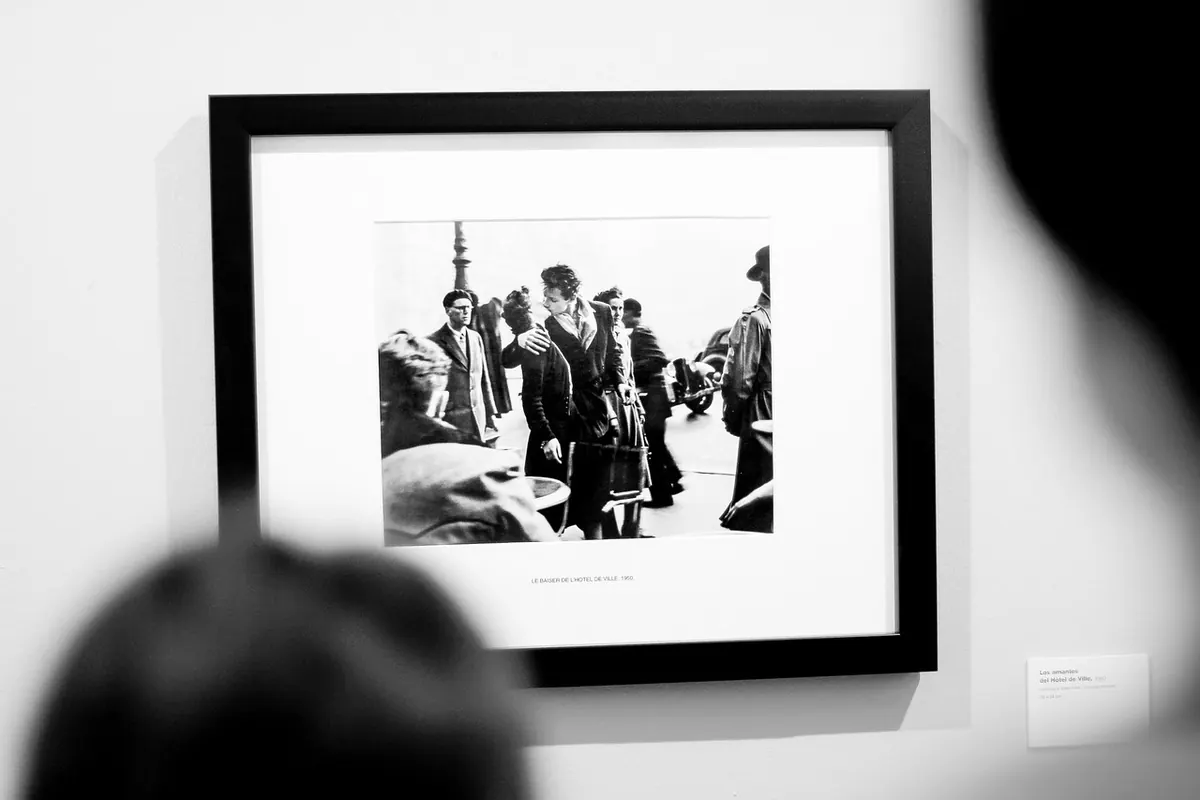
A gallery wall is rarely the result of one shopping trip. The ones that stop you in a hallway tend to be built slowly — a print picked up on holiday, a linocut from a local maker, a piece inherited and reframed. That is good news if you are starting now, because it means you do not have to solve the whole wall in one afternoon. You need a starting point, a spacing rule you actually stick to, and a colour thread that holds the collection together. Get those three right and the rest is patience.
Start with the piece you already love
Pick the one print you would rescue first. It sets the scale for everything else. A large, quietly coloured piece can carry a wall almost on its own, with two or three smaller prints grouped around it like satellites. A small, intricate etching, by contrast, needs company — a cluster of five or six pieces so it does not look lost.
Measure that anchor print before you buy anything else. If it is 40cm wide, you already know roughly the size of the gaps you are filling. Take a photo of it against the wall you have in mind, stand back, and look at how much empty space surrounds it. That single photo will save you from a lot of hopeful purchases.
Four layouts that suit different walls
- The grid. Same-size frames, even gaps, straight edges. Calm and forgiving of wildly different artworks, because the frame does the tidying. Best for a run of prints from the same series, or a narrow wall beside a door.
- The centre-out. Place your anchor in the middle, then work outwards in a rough circle or rectangle, keeping the outer edge as level and block-like as you can. This reads as one big shape rather than a scatter.
- Salon style. Largest in the centre, smaller pieces towards the edges. This is the layout that looks collected rather than arranged. Keep the gaps consistent or it tips into clutter.
- The ledge. A picture shelf lets you lean and layer, swap pieces with the seasons, and add odd sizes without drilling. Good for renters, and for anyone whose collection is still growing.
Spacing: the numbers that make a wall feel calm
Consistent gaps matter more than the prints themselves. Uneven spacing is what makes a wall look accidentally unfinished, no matter how good the art is.
Between frames
Leave roughly 5–8cm between frames. Five for small prints and tight grids, eight for larger pieces. Measure the gap with a tape or a cut spacer rather than eyeballing it — your eye will drift as you go.
Above furniture
A sofa or sideboard usually wants a composition around two-thirds to three-quarters of its width. Anything narrower looks like a stamp; anything wider and the furniture seems to be missing something.
Height on the wall
The middle of the arrangement should sit near eye level — around 145–150cm from the floor for most people. Above a sofa, leave 15–25cm of clear wall between the top of the backrest and the bottom of the lowest frame. Then sit down and check: you should be able to lean back without your head touching anything.
Mixing sizes and shapes without chaos
The rule of thumb is to keep the frames consistent and let the art vary. Mixing wildly different frame styles, mount widths and artwork styles all at once is where most walls go wrong.
If you want to mix frame finishes, limit yourself to two — say, pale oak and a thin black. If you are mixing shapes, let the square and rectangular pieces do the structural work, and place round or oval pieces inside the block rather than on its edge. Odd ones out work best when they are surrounded.
A useful trick: lay the whole arrangement on the floor and photograph it from above. Problems you cannot see at arm's length — a heavy piece sitting too low on the right, a tiny print marooned at the bottom — become obvious in a photo. Then shuffle, and photograph again.
Building a colour palette from the prints themselves
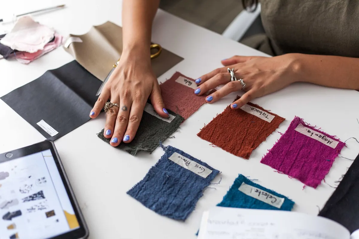
Choose one print as your colour source. It does not need to be the biggest, just the one with the most interesting palette. Look at it properly and note three colours: a dominant, a mid-tone, and one small accent. Everything else on the wall should relate to those three somehow — a mount, a frame, a background paper, a neighbouring print with a shared tone.
Combinations that usually hold together:
- Warm and cool prints side by side, provided the frames stay neutral. Terracotta and rust will sit happily next to blue-grey in pale oak or white.
- One strong colour repeated at three different scales: a tiny flash in one print, a mid-size block in another, a large field in a third.
- Paper tone as the connector. Cream, off-white and bright white papers can look untidy next to each other. If your prints sit on different papers, use generous mounts in one consistent colour to reset the eye between them.
Try not to match everything to the room's accent colour. The wall should carry its own palette rather than echo the cushions.
Try it on the wall before you drill
Paper templates will save you more holes than any gadget.
- Cut paper to the size of each frame, including the mount, and write the name of the print on the back.
- Tape the papers to the wall with low-tack tape, following your chosen layout and spacing.
- Stand back, sit down, walk in from the doorway, and check it in the evening with the lamp on. A wall reads differently in different light.
- Live with it for a day or two. Move anything that nags at you.
- Mark the hanging points on the paper rather than the wall, then drill through the marked paper.
Hanging day and afterwards
Use fixings suited to your wall. Plasterboard, old lath-and-plaster and brick all need different hardware, and a heavy frame on a light fixing is a heartbreak waiting to happen. If your wall is unusual, or the piece is heavy or valuable, ask someone who hangs pictures for a living.
Then let the wall settle. Do not fill every gap at once. Leave a space or two deliberately empty and let the next print arrive when it arrives — from a market, a studio visit, a friend's clear-out. A gallery wall that is still growing is far more interesting than one that is finished.
Photo: StockSnap / Pixabay